Services Brand & packaging
Identity and packaging,
designed together.
Naming, identity, packaging and launch planning, ordered together or one piece at a time. We also work on brands that already exist.
- 01
Front panel
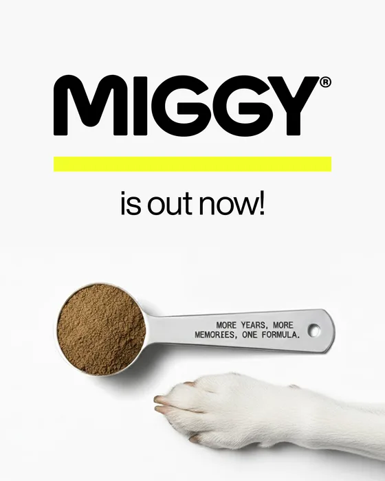
MIGGY in big black letters, then the product name and one plain sentence.
- 02
Directions
One scoop a day, with food, in short lines. Gluten, soy and dairy free as three icons.
- 03
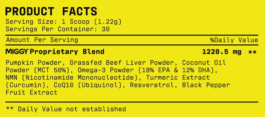
Facts panel
The ingredients, printed on the brand yellow.
- 04
Full wrap
A single rule runs from the name to the facts panel.
Three starting points
You might have a product and a working name, a brand that needs packaging, or a launch already underway. We can start at any of those points.
MIGGYbrand identity
What the identity
is made of
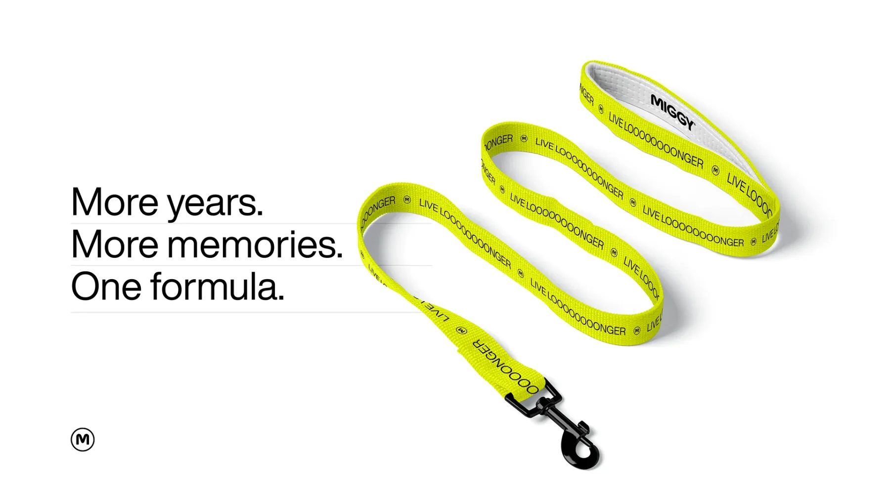
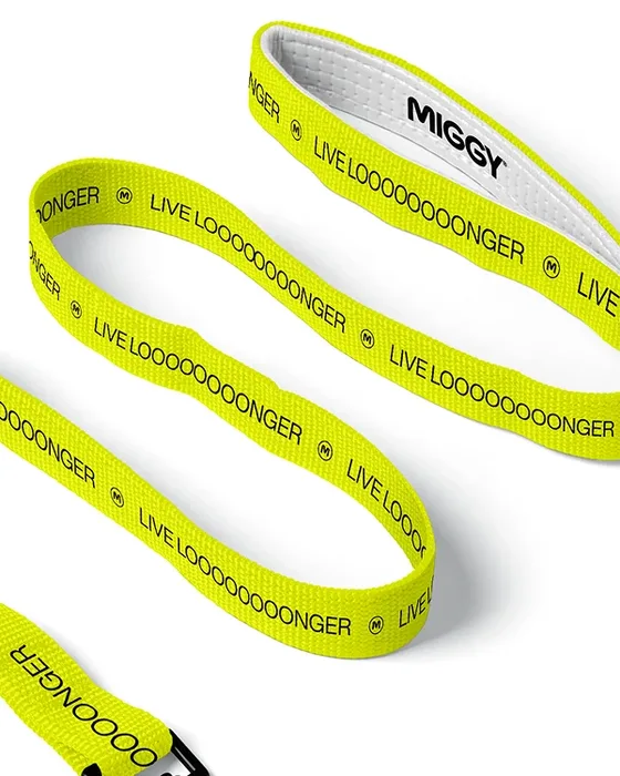
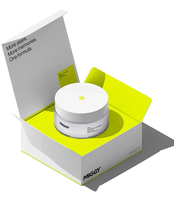
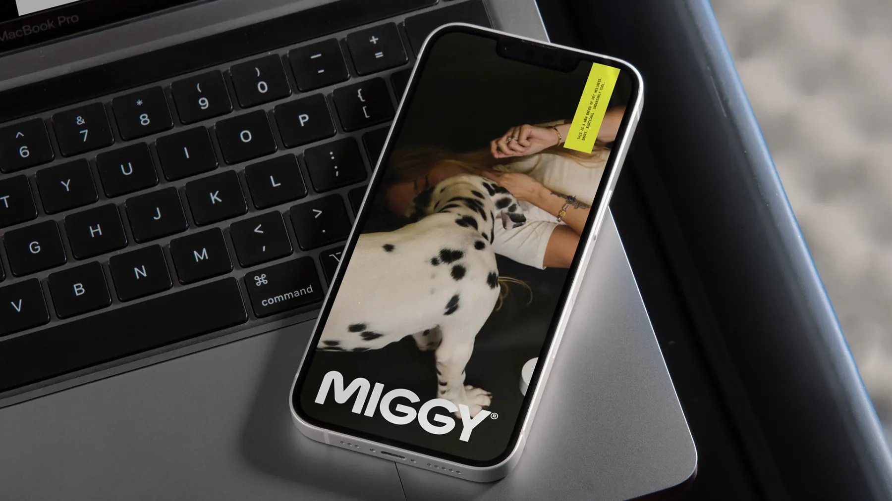
We designed it with EAT Studio: a heavy wordmark, one yellow, two typefaces and a few layout rules. The same set runs on the jar, the box, the leash and getmiggy.com.
Wordmark
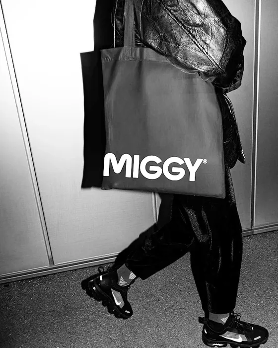
Heavy and round, so it holds on a box, a tote and a phone screen.

Color
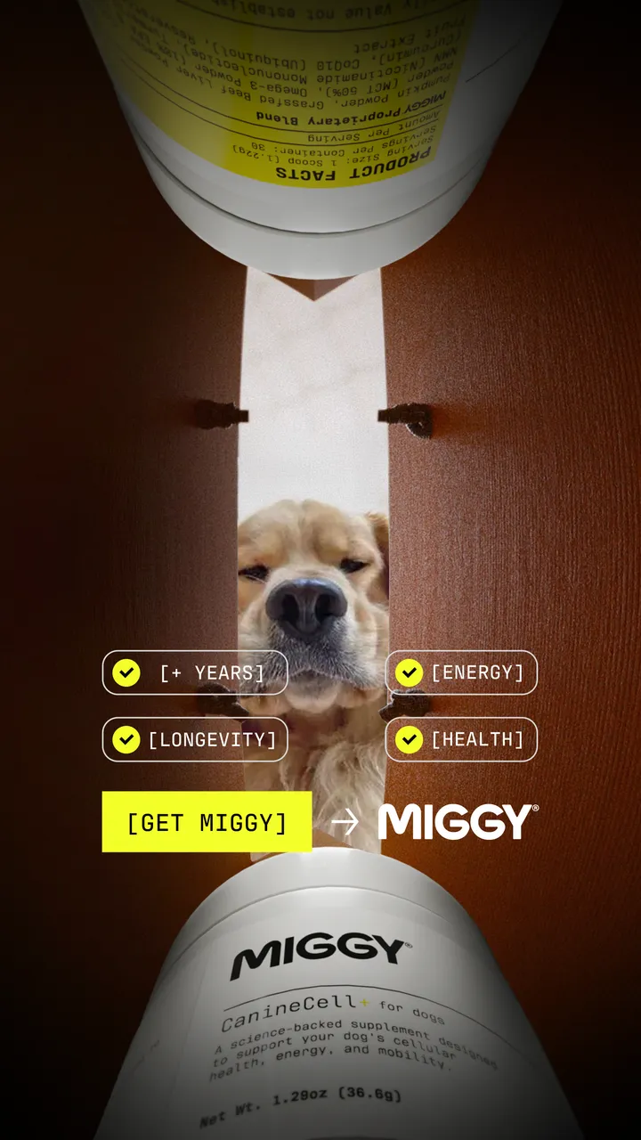
Mostly white, one loud yellow, black for the words. Measured from the label.
- White
- 74% of the label
- #FFFFFF
- Yellow
- 20% of the label
- #F0E614 label file · #F2FE28 screen
- Black
- 4% of the label
- #12120E
- Other
- 2% of the label
Two typefaces
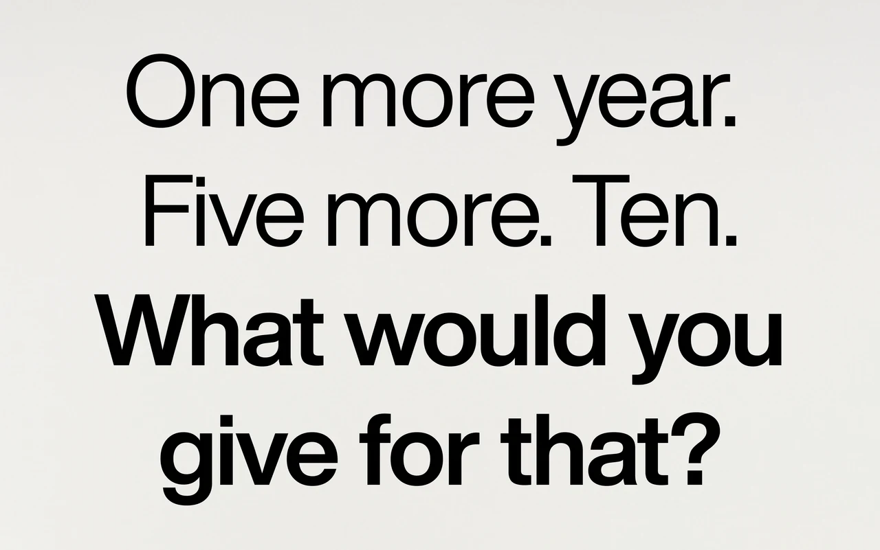
A grotesk for the headlines, a typewriter mono for the facts.
Layout rules
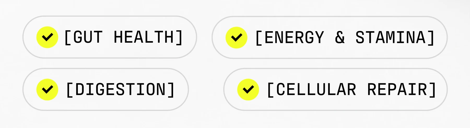
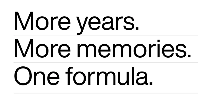
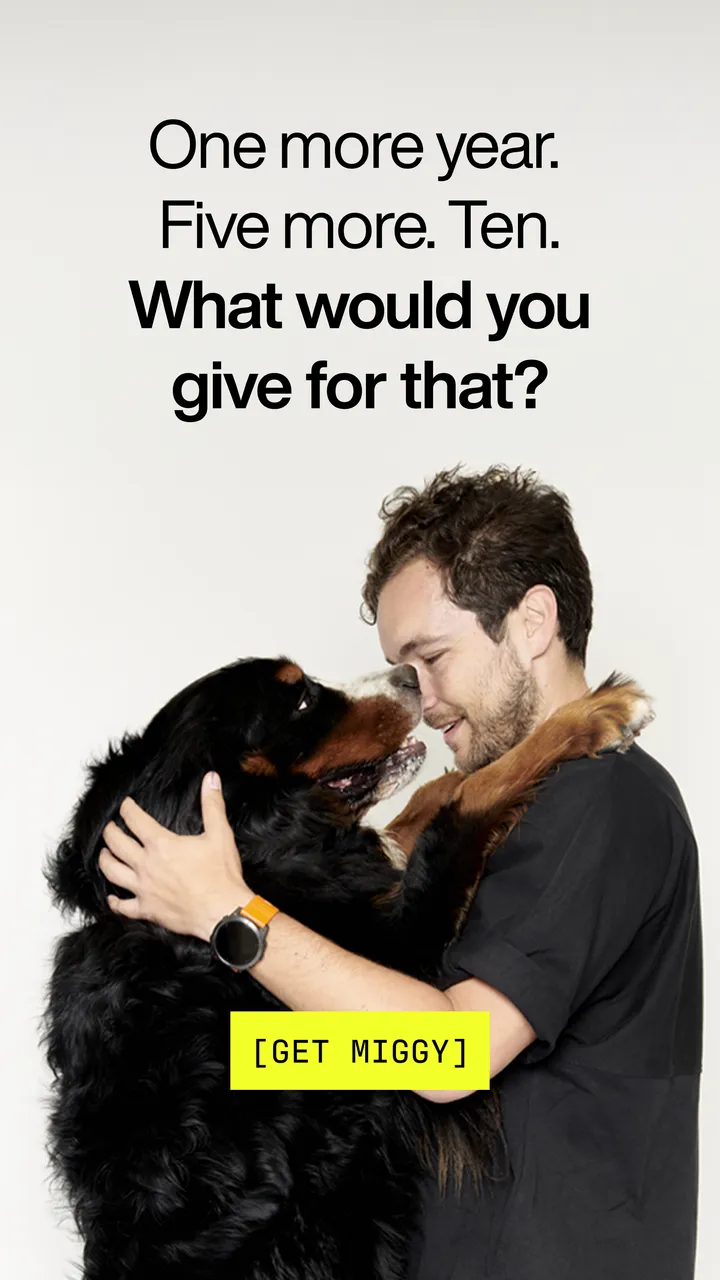
Benefits in brackets, yellow for the call to action, a rule between lines.

MIGGYapplications
Where MIGGY
shows up
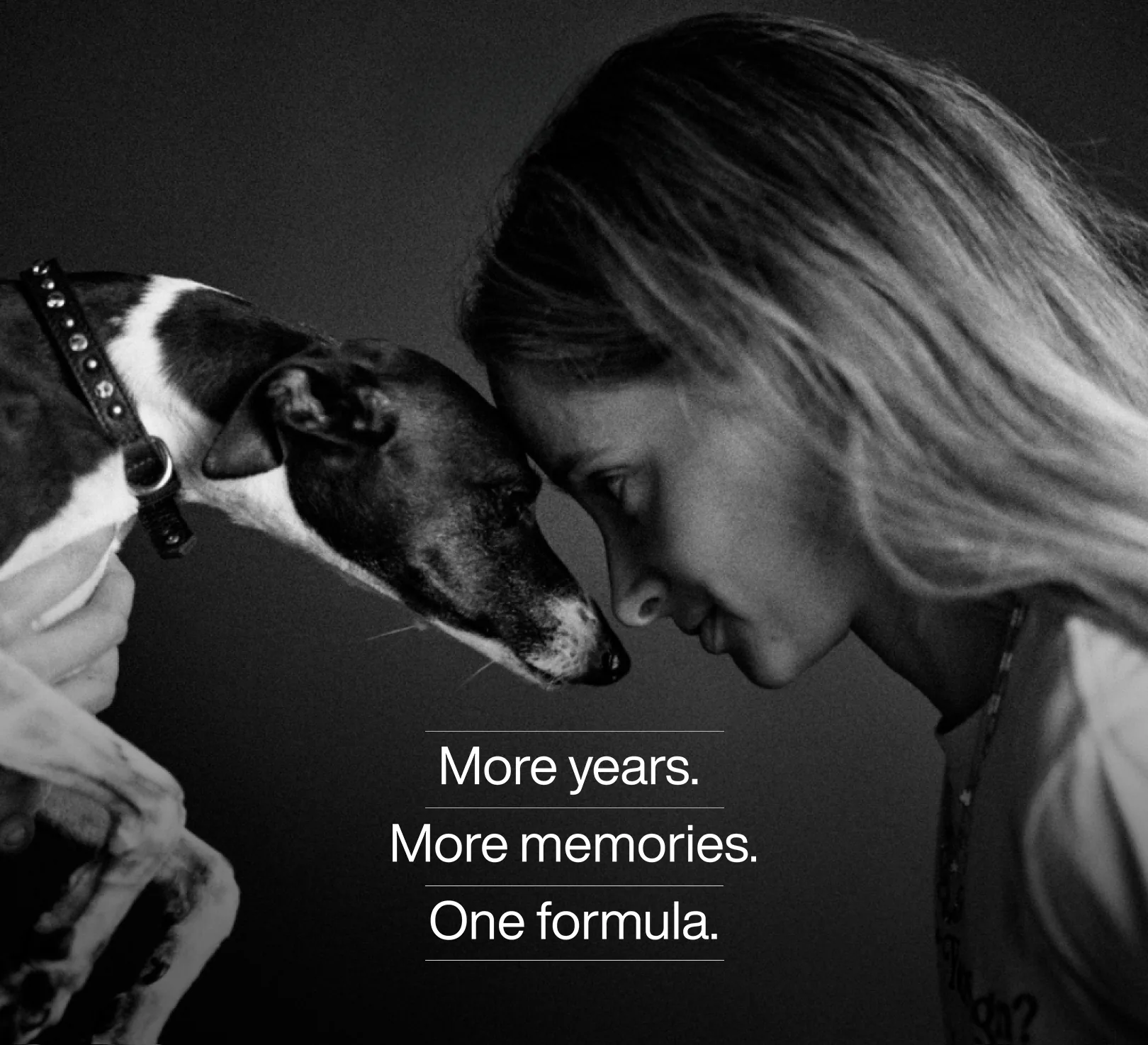
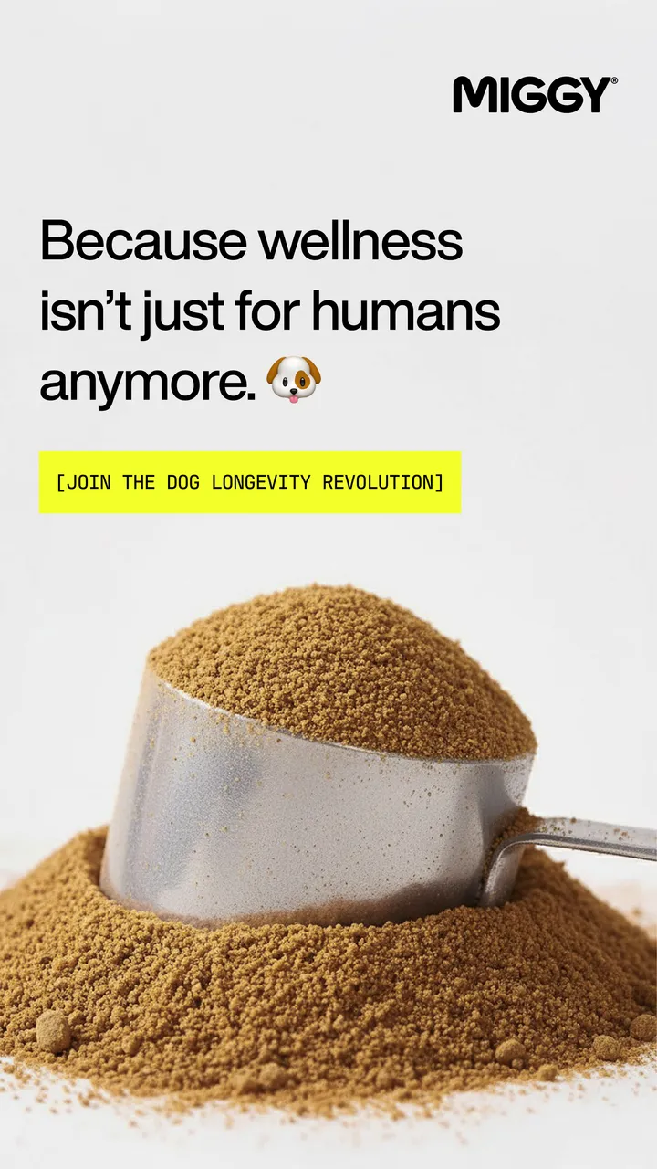
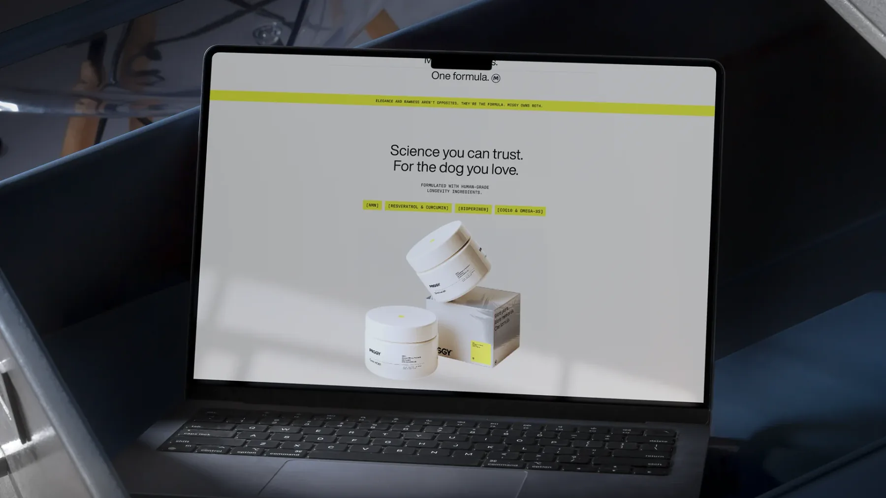
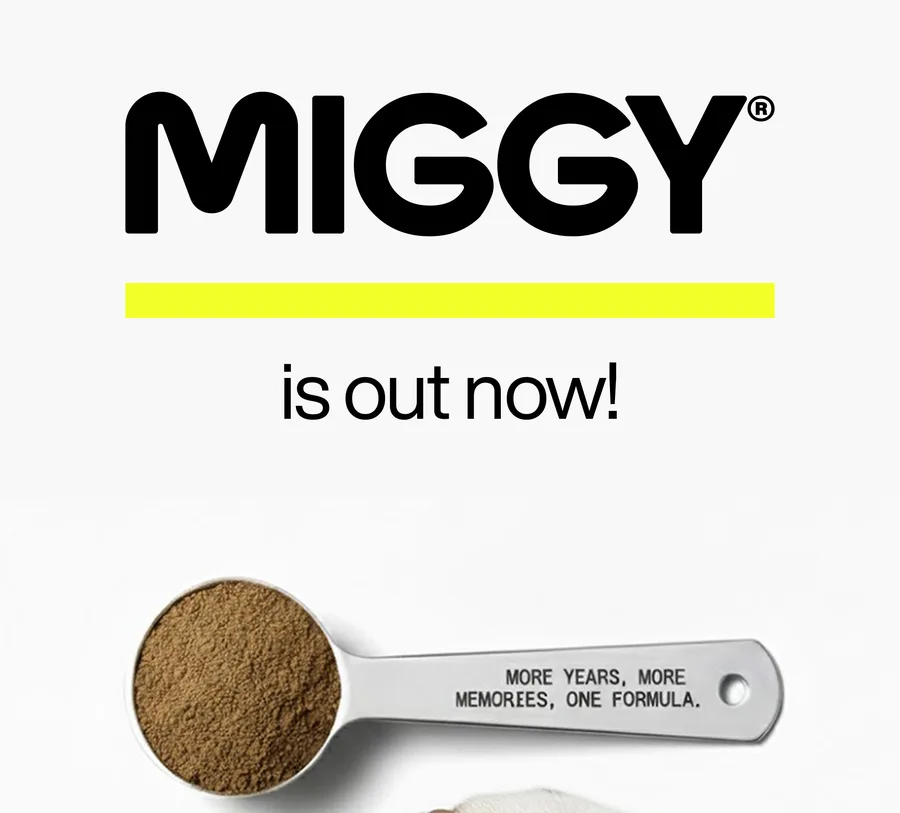
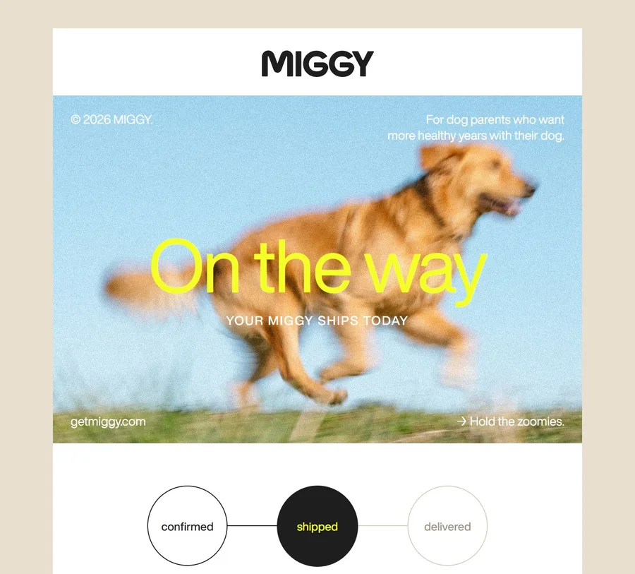
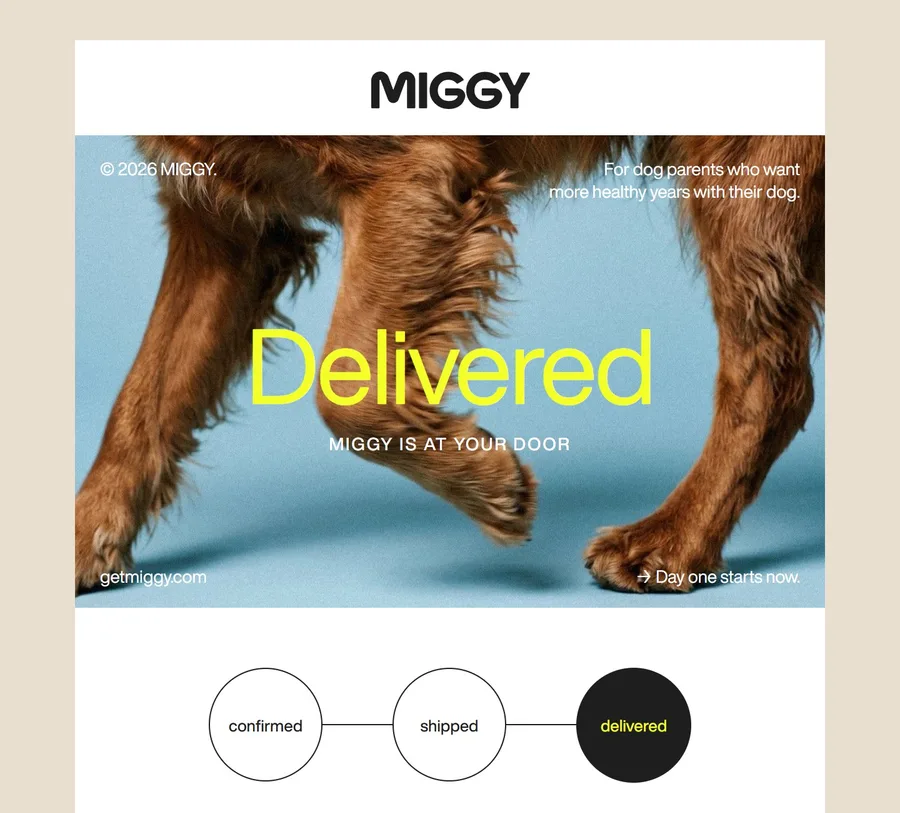
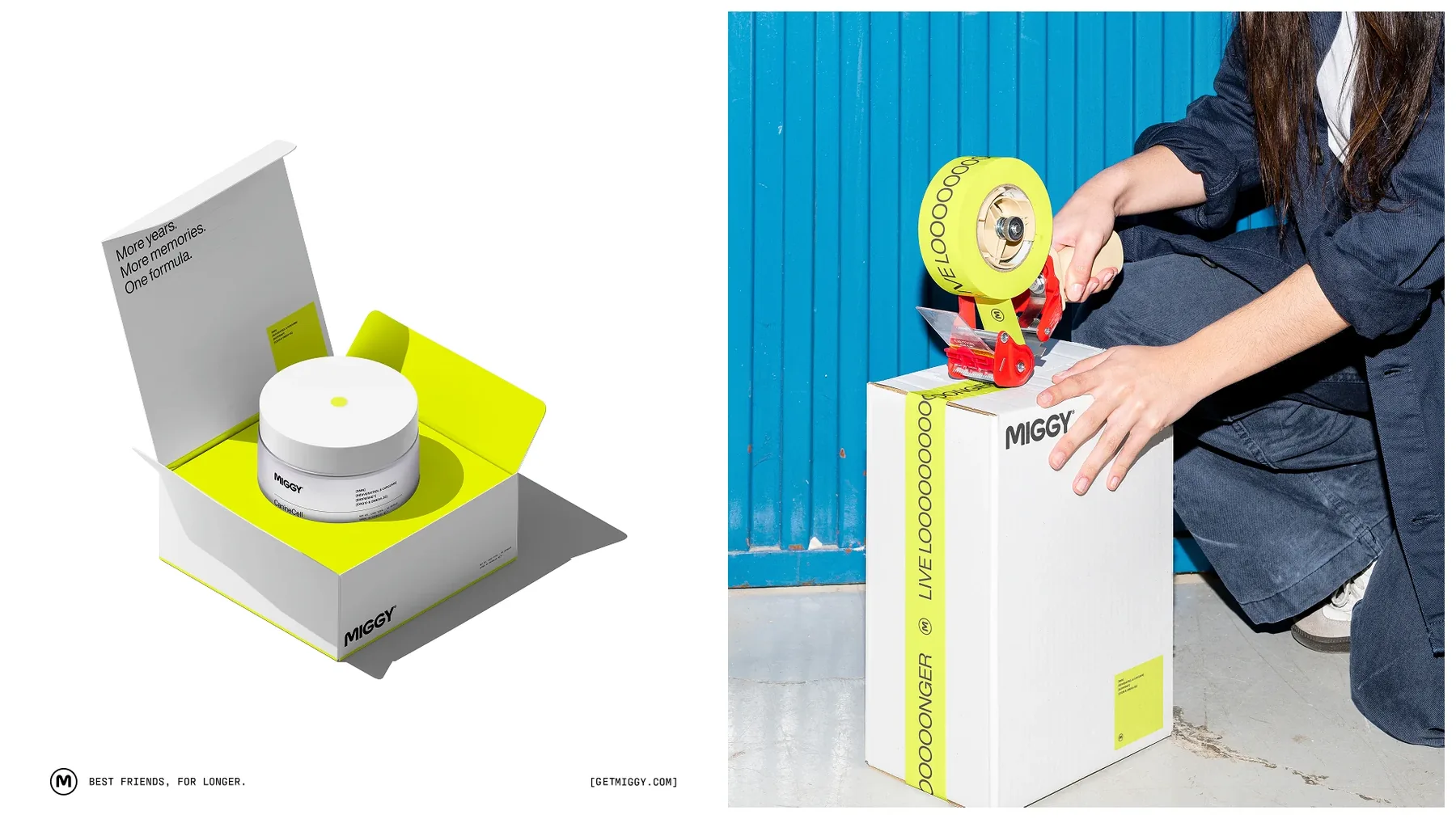
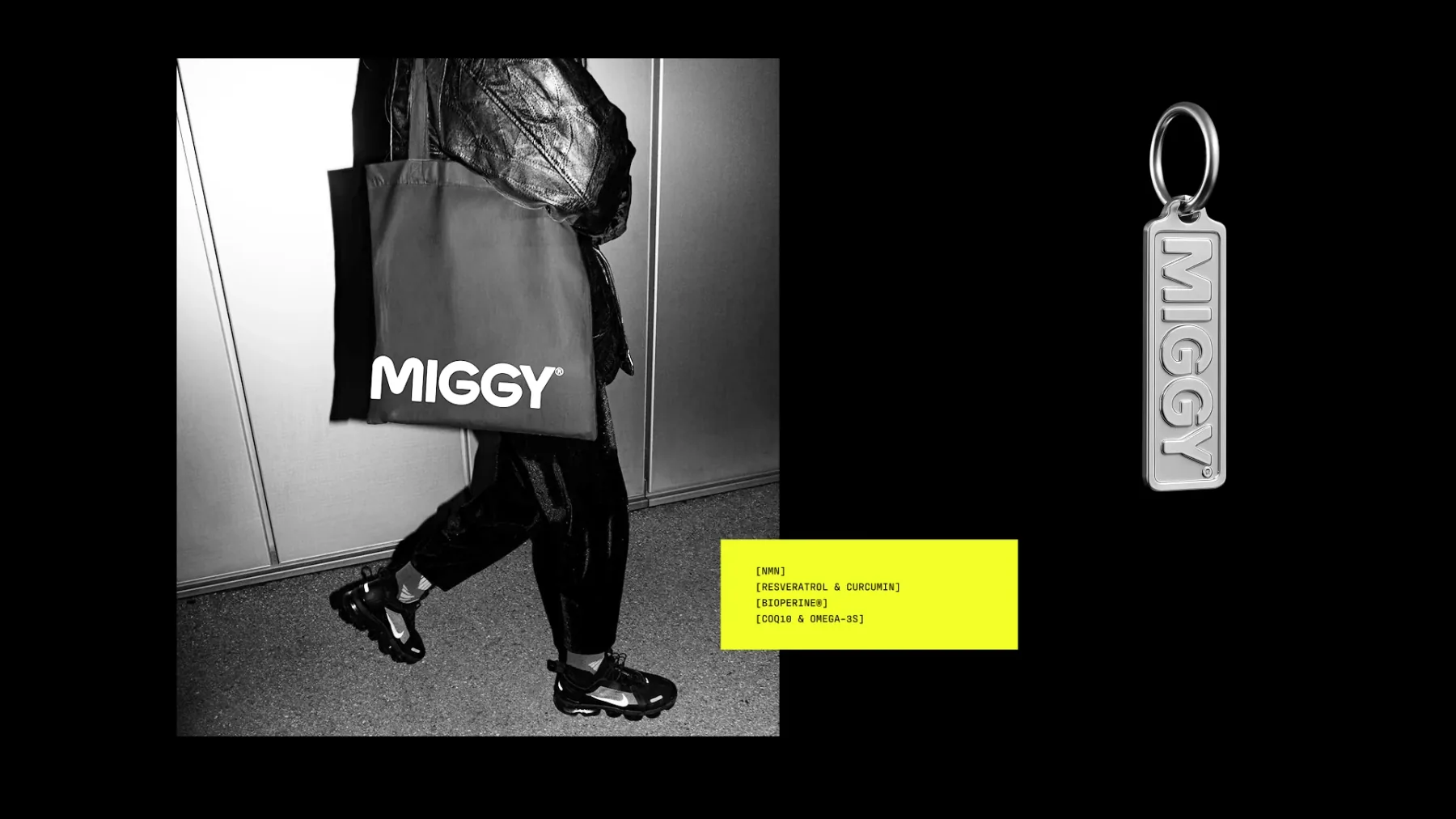
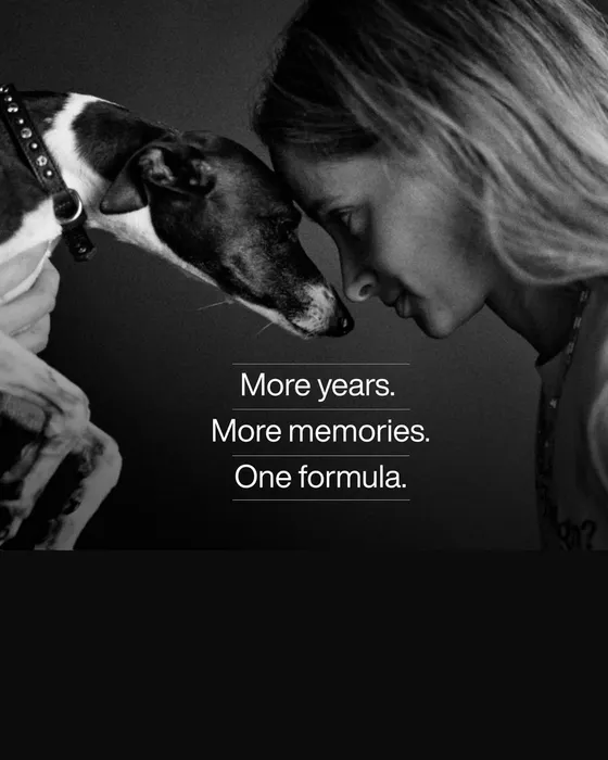
The same wordmark, yellow, typefaces and layout rules on the launch ads, getmiggy.com, the order emails, the box and the merch.
Brand strategy
Who it’s for, what it promises and how it sounds, agreed on before anything is drawn.
Naming
A name for the company, the product and the product line, and the taglines that go with it.
Visual identity
Wordmark, color, type and the small rules that keep them consistent.
Packaging design
Labels, boxes, inserts and tape, designed on the real dielines and ready for print.
Launch planning
What goes out first, where and when: the key visual, ads, emails and posts.
“Artists of form, and above all, very human in how they work. Always approachable.”
To start, send what you have.
Common questions
Can you work with our existing brand?
Yes. We can extend an existing identity into packaging, product imagery or a launch.
Are naming and packaging always included?
No. We quote each one separately, so you can combine only what your product needs.
Other services
Tell us about the product.
A few lines in the form below are enough.